Showing posts with label screenprint. Show all posts

Saturday, 7 July 2018

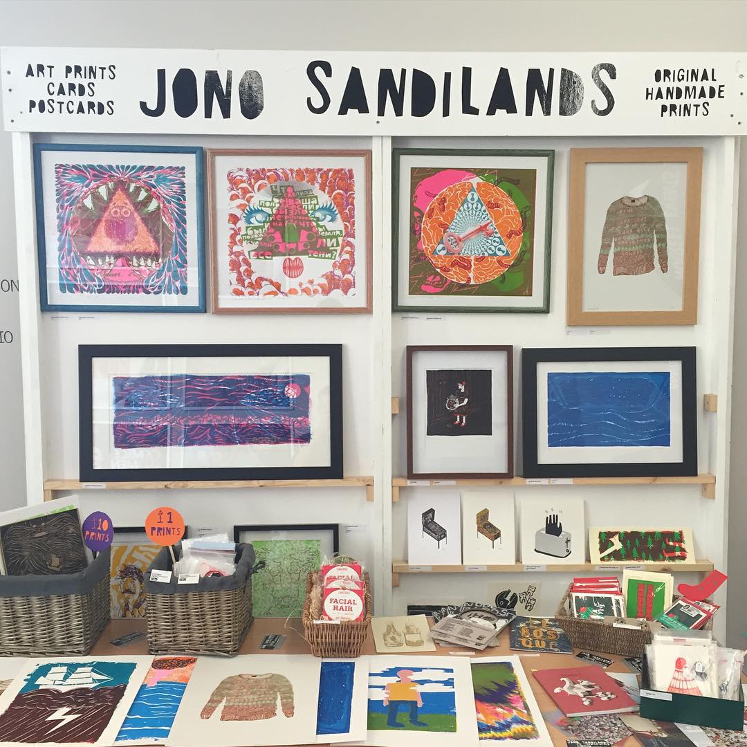
Playable Prints opening night

Playable Prints

SPACE (6 West St, Bristol BS2 0BH)
4th-8th July / 11am-6pm OPENING NIGHT Thursday 5th July / 6pm-10pm


Thursday, 28 April 2016

Never: Playfield Art


In true pinball fashion I'm 'leaking' the playfield artwork. It's been a busy week of finalising the artwork and printing, I'm so excited to share the high res pictures of the printed playfield.

The aims with the artwork was to have references to traditional pinball machines, while retaining links to my own style. I wanted to do something which wasn't 'safe', but also doesn't overpower. I felt it important to leave areas of unprinted wood, to remind of the materials which make the physicality of pinball I've fallen in love with.

Four weeks left! Stay tuned for some serious progress on the final assembly.

Let me know any questions about the art or my ideas for gameplay and I will answer them! Leave a comment or tweet @jonosandilands.
Full Playfield 


Monday, 25 April 2016

Never: Playfield Screen Print

Watch the playfield come alive!
The playfield is printed! It's been such a huge milestone that it feels like a real sense of achievement. I'm delighted with the results, surprised I feel like I achieved what I set out to do with the style. The references to traditional pinball and links to my own style and imagination for how I envisaged the visual style.

Registration is designed to be fairly loose. I'm almost welcoming slightly off register for that true pinball look


It's hard to go back and imagine what I really originally pictured the artwork to look like when conceiving this project a few years ago, but it captures so much little ideas from over my research and most important is fun. Infact it was incredibly fun to produce the artwork and print it, something I had hoped for but just naturally worked out in the end.

Making sure the flood is adequate for printing - Thanks to Arthur Buxton for the assistance!


I've always loved the overlay of colours when screen printing - watching the process is like magic when new colours start to appear. 


Playfield detail unfolding colour by colour
Anyway I'm glad I stuck with the direction and like finishing everything, now it's onto the next stage and the challenges that next phase of assembly throw up.

First I need to decide if I clear coat the surface for protection. I have three options:
  1. No clear coat I think the art will wear away and chip very fast if unprotected. The wear when interesting may look incredibly rubbish! I want the game to have some lifespan, and if it wears away quicker, that is going to seriously shorten.
  2. Complete clear coat - I've almost already thrown out the idea of no clear coat. The fastest and easiest way would be for an all over clear coat.
  3. Sections of clear coat is really interesting - the idea that some areas are protects and some are open to the destruction is a pretty exciting concept. It could be traces of a previous game which are set and recorded into the playfield with the clear coat.
The application is always going to be a problem,- generally the work areas I have access to where this can cure are dusty uncontrolled environments, so I'm not expecting a perfect coating.

As don't have a budget for getting done professionally what are my options; brush or spray can? I think best option would do some test coats on scrap to find a suitable spray can.

Thursday, 21 April 2016

Never: Playfield Artwork

I made a break through in the artwork. I've been in a bit of a creative block mode, struggling to get the art to the place I envisaged. 

Yesterday when digitally sketching, everything seemed to click into place. It's a feeling I can't quite describe, but when working there is some sort of rush and excitement to keep chipping away the built up layers of creativity, with the months of testing and research all bursting, ready to flow out when everything comes together again.

Testing different possible layouts. The idea isn't to make final art, but to spark ideas. Quckly
Heading in the right trajectory 
As I left the studio at 6pm, I realised how much fun I had sketching. There has been somewhat amount of pressure I've been putting on myself about getting this right and also telling myself I need to remember to enjoy the process and go with it. When at the time there were some low point in terms of confidence, I think those moments were ultimately important to getting to this stage. Basically the creative process!


Of the ideas, the one that seemed to cause that spark was the trace lines or trajectory lines towards the main targets on the playfield. Originally I drew thin guides to line some other artwork ideas up, then I accidentally selected one and increased the thickness, and had one of those 'oh yeah, lets try that' moments. It's funny how things work out.

I'm really liking the effect around the logo at the bottom, through use of overprinting CMY(-K) colours.
On Process colour (Cyan Magenta Yellow)
I chose to use process colours as this is solely what I have been using to print this year. Not that I'm boxing myself into only ever using process colours, but because I find it pleasing to have some correlation between my pinball machine and my pinball prints in the final show.

CMYK is really a way of saving a bit of time and opening out flexibility in the final. Originally I thought I might have a simple two colour print, when my ideas started flowing, so did the colour count. Printing these colours individually would be a five colour job, if not more. As I don't require the black it's a three colour print using Cyan, Magenta, Yellow and the awesome overprinting effects as a designed outcome.

Revisit old ideas

I started to revisit ideas of visual style I had previously started to move away from, realising they were still relevant in my work. I've learned that this is a better way to approach; start by picking out pieces where I left them instead of leaving them to gather dust. I tend to push past projects away instead of pulling them close again.

When visiting family in Shetland, I revisited old prints and attended a makers market
Revisiting these old prints reminded me one of the reasons I decided upon a printmaking course rather than a design course, its because I always turn to printmaking for 'creative relief' in my personal work, these are the things I do to fulfil my creative urges outside the commercial day job. Also I have lots of prints, please buy some! Email for a price list.

I always wanted the playfield artwork to be a reference to traditional pinball, but also incorporate my style particularly from earlier printmaking work prior to the MA.

Pick up where I left off
Picking up where I naturally left of using handmade methods to create effects and textures, I've found some ways to achieve these techniques digitally.

I really enjoy working out processes of how to do things, taking note of the steps to achieve a particular effect, then applying them multiple times under different circumstances. Although part of me strives to do these handmade, I have more flexibility with the end result working digitally. Also it's a lot faster.

Steps to achieve Noisy Gradients in Adobe Illustrator

One of the techniques I developed with help from the internet is to create what I'm calling Noisy Gradients


A section of the final art using the noisy gradient technique
Partly, the noisy gradients are a reaction to not wanting to use a halftone. There's limitations in control the moire effect on a bigger, lower mesh count screen. And also limited by the space I have to lay the play field wood flat on the print bed, so my plan is to use only solid spot colour style in the final screenprint. The noisy gradients were also inspired to some classic pinball artwork.

Roller Disco Pinball - image source

On a role / never sleep

Upon getting home last night I just kept working, before long it was 4am and I was pretty much done. I've taken the ideas and concepts from the lines of trajectory and the visual style of different techniques and brought them together in something which really is beyond what I really have thought it could have been. Sounds quite emotional and it probably is cause I've not had enough sleep!

Final playfield artwork, ready for print (high res) 
There's a level of simplicity I had hoped to retain in large areas of solid colour, but also as you dive in more there are interesting areas of textures and abstract chaos that my instinct wanted to include.

Method in the madness
After lasercutting I was blown away by some of the interesting grain in the wood, and how almost naturally wraps itself around some of the insert cuts. It was unintentional and totally unique to the bit of wood. It made me realise there were areas of wood I wanted to leave unprinted, the use of white space and less is more, having some breathing areas, and also reminders of what the object is built from.

Speaking in terms of how the artwork applies to the actual pinball game. The basic concept is; where the ball travels towards a main target area, the art is quite linear, direct and flat, but after a target is made there are little pockets of explosions and chaos that will ensue in the artwork and in the game, which I plan will get more intense as you progress and the longer you play.
Mockup how it might look printed, although impossible to fully get a good idea till it's printed!

Would it look different if I did it again? 
Yes of course! And after I print and assemble the parts I will notice mistakes and changes I would to make, but it's at that time in the process where I need to stop - I've invested time and energy into it and believe that will shine through in the final work.

Although I'm a bit behind my ideal schedule, it's full steam ahead printing!

Tuesday, 16 February 2016

Student Print Exchange: Development

I had thought my initial concept would be too expensive for making an edition of six for the exhibition. I have now spec'd the project and it comes in at around £70 per print, which is almost double my initial expectations.

I had thought of some other options for interactive prints, but I'm kinda latched onto making this thing happen either way.

There is the option to make two prints for the two Universities, which are embedded with the digital screen, then the remaining prints are as a normal screenprint.

So lets put these thoughts of not possible away and get on with it.


I have Raspberry Pi kicking around that I've been playing with. So to try things out/proof of concept, I get a LCD screen ordered on Amazon. It only takes a few days to arrive but I need to get on with the artwork and screenprinting.

It's a natural continuation where I left off with the mini print. I think the prints were quite successful but I can improve them so much. the good thing is, I can use the Blender file as a template make amendments and map new artwork.


From here I can now calculating the size and position of the print in relation to the screen
Getting the size nailed down now, means I can get on with printing the edition so I'm totally ahead of the game later on.
learning from mistakes made with mini print, I thought about the black seperation and removed any black print from certain areas, while retaining black in areas I felt important. During printing I also opted to remove the harsh black from the legs as it was really over powering. Learn new things with every new print.
Having thought about building a housing for the print and Raspberry Pi, I eventually came to the conclusion of using a float frame and found the perfect frames from Vellum Art.

The frames need a small adjustment - spacers to place a backboard to attach the Pi
Close up of the spacer and the backboard
The reverse backboard is attached with framing points. 
Close u p of the points in place. Pointless.
 The print gets the playfield section removed, and mounted to self adhesive foam board (also with a section removed. Once installed into the frame it leaves a neat section for the screen to embed itself into the print.
Carefully cut by hand. I pondered lasercutting but don't want to introduce soot.

The reverse when mounted - the screenprint paper with the playfield section is a smaller cut, then the foam board is cut exactly to the size of the screen at a 45 degree angle.
No when the screen arrives I need content and I prepare the video. The template I made to work out the size of the print can also be used to map and warp the video. I use the corner pin effect in Adobe Premiere. Export the video and start about the Raspberry Pi development.
The assemble pi in place, snug fit into the mount board to get as close to the paper as possible

Pretty good I think.


The pi is relatively easy to setup to loop video thanks to Adafruit's video looper tutorial. It's a bit fiddly to get to grips with but once going it was easy.

Now it had it setup I just clone the software for the Raspberry Pi micro SD card, and reformat the second print with the identical software so I don't always have to go through the installation process. It takes a long time to clone, but it means you can go away and do something else, you dont have to be present! I used this guide for cloning and making backups for Raspberry Pi.

Check it out, looking fantastic.
At this point I start to realise how important sound is, I'm jumping through many different ideas trying to work it out still, and it deserves a post in it's own right.

More to come soon, almost deadline time!

Tuesday, 2 February 2016

Mini Print


Process post about the Mini Print project.

About
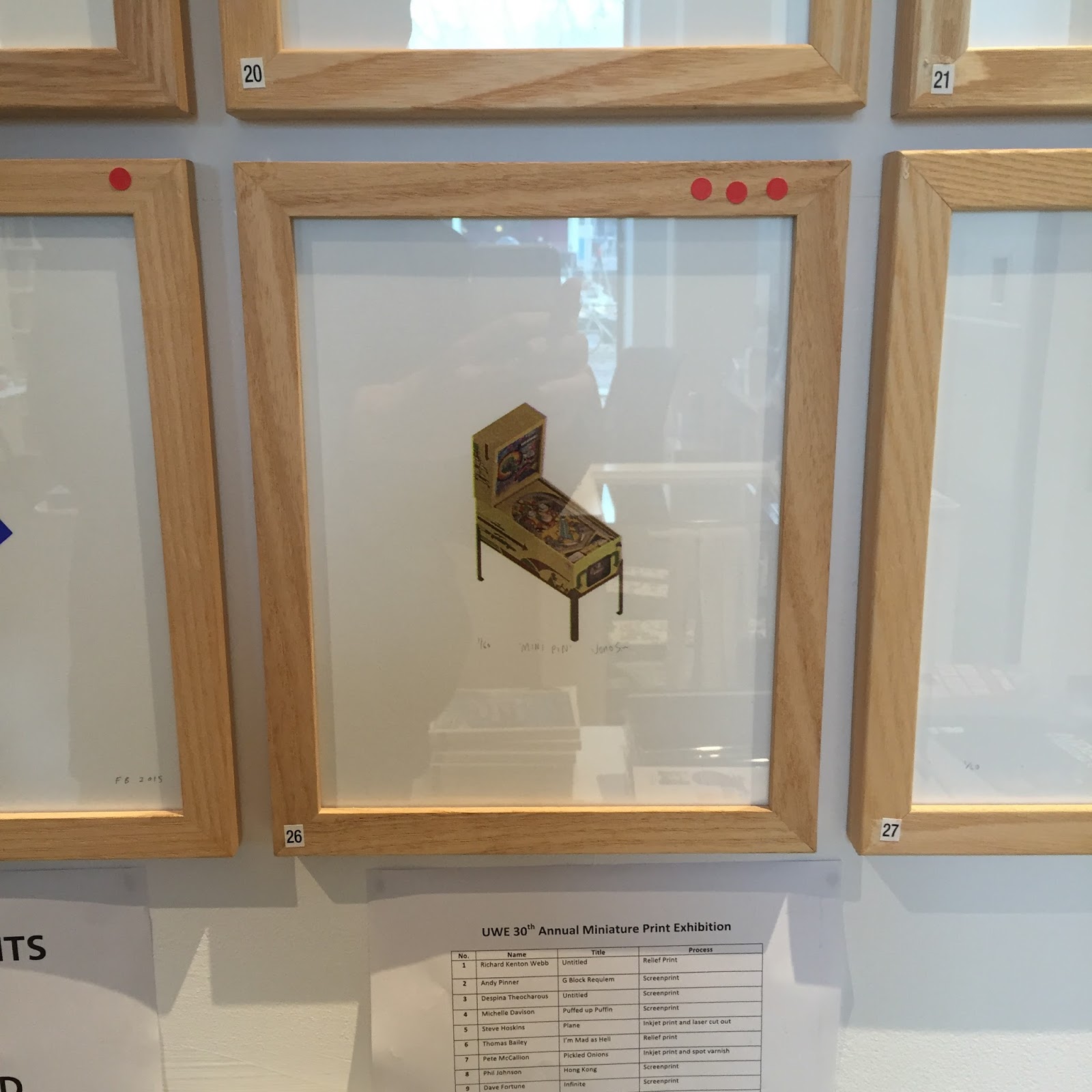
The annual Mini Print is an exhibition by UWE MA Multi-Disciplinary Printmaking students and staff.

Format: 20 x 25 cm paper, and a maximum image size 10 x 8cm Edition: 60
Arnolini Bookshop, Bristol
Preview: Thursday 3 December, 2015 (5.00 - 7.30pm)

In return for participation, each artist receives a full set of 30 prints. 5 of the remaining prints from each edition are archived in the CFPR and UWE collections, and the rest are available to buy.

For more information see: Website

Concept
The subject and medium for each print is dictated by the individual artist

For my print I plan to produce something which relates to the theme of my final project, but also acts as a testing ground for the direction of my work, particularly in terms of execution and style.

Conceptually I am exploring the relationship between digital and physical objects using the theme of games and play - specifically pinball.

This project will be a chance to execute ideas of sketching digitally in 3D software and how that object translates to print (or physically in some way)

Proof of concept
I've explored this idea of drawing 3D and translating to print. 
Examples: Visual Thought & Particle Memory

I want to expand and refine this. Part of that is to become better at using 3D software. I've decided to focus on using Blender as it is open source and I am finding it easier to work with than Rhino.

Experimentation 
(starting 17 September 2015)

I'm going to start producing a series of test pieces to explore using 3D software as a sketchbook and outputting up to the stage of ready to print files.

I will list these below, showing mockups of frame artwork with notes.


001 
17/9/15

Notes: Practice creating basic 3D geometry in Blender, testing workflow for exporting the image and processing in Photoshop with diffusion dither for screenprint.

Trying out a layer of colour but not happy with the murkiness - need to retain (or try to recreate) the vivid RGB colours - few ideas to try (change key colour, and export the colour layers flat).

Technical note: because I am creating these for the intention of screenprinting I want to find a workflow I can generate the separate layers of colour almost directly from Blender.

Workflow:
Key Layer Material white / Blender render image / Photoshop Diffusion Dither
Colour Layer Material coloured default / Blender render image / Photoshop Diffusion Dither


002 
18/9/15

Improving the vividness of the representation of colour. 2 versions trying out the two ideas I had from 001 - to export the colour layers flat (with no shading) and change the key colour from black to (in this case) purple. Much happier with these results.

Workflow:
Key Layer Material white + increased intensity / Blender render image / Photoshop Diffusion Dither
Colour Layer Material coloured shadeless / Blender render image / Photoshop Flat artwork as exported


003 
18/9/15

Ok I need to work with more complex shapes, not just the out of the box ones in Blender. Start by drawing a pinball flipper using similar methods to my previous examples.

Importing Illustrator files as .svg. I'm comfortable drawing in Illustrator so think this could be the best way for me. I had some problems with the export settings from Illustrator to get .svg files into blender this forum post solved it.

This tutorial was helpful for working out some more things to know in Blender when importing .svg from Illustrator. (Convert to mesh from curve)

Workflow:
Shape drawn in Illustrator saved as svg / Blender import + scale + convert to mesh + extrude etc


004 
18/9/15

Curbing my curiosity a bit with this experiment. Basically wondering about going totally flat with the style instead of the grain, which is making things a bit murky looking. There's options to explore here. It may well be about finding a balance. Will schedule some time to screenprint a test.

One with background could be a digital print - I don't have to constrain myself to screenprinting. Second just by removing the background maybe helps. Third is a mix with no background and grain (with key colour grey). Liking where it's going.

The concept and qualities I originally wanted to achieve was to create this grainy vision (in a way recreating a thought from a visual/dreamy memory). The diffusion dither lends itself well to screenprinting too but I need to test it won't be too messy looking - I want a refined print.

Getting more familiar with Blender already, so far this has been a good exercise. I often find myself guided by software, so this was a good test of having an idea and trying to execute is as I envisioned.


005 
19/9/15

Attempting to execute an idea of using a pinball cabinet to the size of the mini print, rotated at an orthographic angle instead of being straight. After playing around a bit I decide that wasn't working, as it looked like it was floating, hence why adding the legs.

This is really an exercise in mapping images onto the 3D object - UV mapping.

The designs are based on an old pinball machine that I am currently restoring. I'm going to need to recreate some of the graphics on it so I figure it would be good practice to recreate it in 3D too. If I go forward with this I'll add the playfield and maybe the backbox too.

It'll be even better screenprinted, but will need more work to separate and retain a flat shadowed look.

This tutorial and This one were helpful.

Workflow:
Blender UV mapping - export UV Map and place graphics in Photoshop Import mapped art into place

006 
20/9/15

I was curious about adding the flipper I had previously drawn to the blank playfield of the cabinet I drew in the last experiment, obviously I didn't want to draw the flipper again, but I also knew there would be a way to work with external files -linking (retains a link to the original file so if any updates are made these will come through) or appending (just takes a copy basically).

This tutorial explains appending and linking from other files.

I should start making a bank of pinball parts which I can just link into the files I make. Keeping each part separate will be good for project management.

I've added the bumpers for the Expressway pinball machine, along with some rough placements for some other parts.

Note the importance of file management (if files move this destroys links) and also naming layers - I haven't been doing this so far - many layers name 'cube' isn't helpful when linking objects.

http://www.cgtextures.com/ for textures.

Workflow:
Blender Link - import Object (note not the mesh) from another Blender file (.blend)

Print Test
At this stage I was happy with the route of the artwork so I could go ahead and draw the remaining parts on the Expressway. However I was still in between printing a close up of a single pinball part or the full pinball machine in tiny scale. I needed to make a decision to use the diffusion dither method I had been planning on doing to create a speckled/misty/grainy vision - so I went ahead and did a test screenprint.


Note the moire effect from the diffusion dither on the screen - because it's a random effect, unlike the process seperations there's no defined angle (I don't think there is anyway). At this size it's not working for me. I was pretty set that the diffusion dither was indeed too murky and wasn't going to work, so this helped make a decision to use process separations (CMYK) with an ellipse halftone. Also helped me make up my mind to print the tiny little highly detailed pinball machine rather than a close up of a part which kinda makes no sense.

Final Art
No more time for test prints, right to the point of printing the edition of 60 four colour prints.


There was a little bit of dilemma about printing the process black layer - the black dirtied up the pinball cabinet artwork, which is a bit disappointing, but on the other hand it has really made the playfield parts pop out and become defined and detailed even at a tiny scale.
 I'm glad I went with the black after a lot of suggestions by others in the printroom to leave it off. For future it does make me realise how I need to do a bit of tweaking to colours before hand to avoid a murky build up of colour, or use spot colour. I could have used stop-out on specific parts along with a different black which is not as powerful as process.
Signed and numbered
Framed print during the exhibition at Arnolfini
Unframed print
For more information, to see other prints or to buy my print see the Mini Print Website.