For my first post I will show the design process of an identity/ business card for the person who is responsible (my inspiration, you could say) for getting me into this here blogging - Abby, from Shetland My Love - a really great blog about life and tourism in Shetland.
It all started through twitter (@jonosandilands) - Abby had seen I was a working graphic designer in Shetland, and after emailing, we met for a brainstorming session at our designated meeting spot, The Olive Tree Cafe in Lerwick. We spoke about alot of ideas but the main objective was to create a business card for her to give out to the people she meets, and obviously, to attract more people to the blog.
First step is for me to go away and think about the project and supply concepts as a basis for what the design will be.

My first experiments were using the love heart shape, cutting it up, playing to create something new from the shapes. Using the shapes to write with, in a tactile manner to create a bespoke typeface for Shetland My Love.


Named 'The Love Mark' the final logo using the font, replacing the 'v' with a love heart.
Moving on, I did a bit more research, asked the question how can I create a dynamic brand identity using something as iconic as the love heart shape, and then it hit me - heart shaped hands...

Reproducing the Heart - Using the human body - hands, to create the heart shape. Adding this deep level of personality to the brand.

The concept would be photo based using landmarks etc across Shetland in the middle of the heart, from the the point of view of the user. One technical issue is taking the photos of your own hands, to create the examples I had to do a bit of stretching and strange body positions to get the shot set up right.
Abby wanted me to push it a little further to really capture the feel of the blog. She was very keen on incorporating the Shetland flag to get the idea across this is about Shetland. The flag is something I try to avoid using if possible, due to over use of it in logos here in Shetland, plus I feel its really quite obvious, and boring.
I found it quite a struggle getting the flag to work, and Abby's idea to use the flag in the love heart worked best. The Shetland dictionary came in handy when researching words to do with love, and these could be worked into the brand. 'Smoorikens' simply translates to 'kisses'.
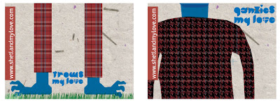
The Shetland words allowed me to play around with other ideas, incorporating a bit of wit and illustration. Iconic Shetland objects, traditions, folklore and places could be used to show exactly what Abby want us to know she loves about Shetland. A 'Trow' is a creature in Shetland folklore, and a 'ganzie' is a knitted jumper!
By this point I had become quite attached to the font and felt it was totally right but, what happened next shows that the simplest idea is sometimes the best...

I had sent Abby a sheet of experiments of me trying to incorporate the flag into the logo to let her see what I had been doing. On this sheet was this heart map of Shetland, I had just done quickly and then disregarded as I was quite set on where the other concept was going.
Turns out this image says exactly what we were trying to find, its perfect. I realized the other ideas were becoming quite complex and this was great as it is a simple solution to the problem. Everything was simplified and we sent the files to the printer to get these great results!
Big thanks to Abby! And keep up with her goings on @ Shetland My Love.
Please tell me what you think! I would like to find a format for showing the process better. Suggestions are welcome.


so cool! forgotten how many ideas we brainstormed and great to see the process written down with phots. Really pleased with end design - perfect! thanks so much.
ReplyDeleteYay! Brilliant. Had lots of fun working with you!
ReplyDeleteHi Jono, good work, I love these! You definitely shouldn't let the other ideas go to waste though - I'm sure there could be room to use them.
ReplyDeleteHave started checking out the blog too, Abby!