Tuesday, 10 May 2016

Never: Game Mode Outline

This document is also available view/download as a Google Doc here.
Custom pinball by Jono Sandilands


Game Mode Outline *work in progress*

My aim with the whole machine is to have references to classic pinball machines while showing my own style and creativity. My theme is a bit unconventional to commercial pinball machines (which are usually movie, tv, music or other licensed theme).


Find more images of the playfield art here to get a feel.


The Symbols

The whole game is based around the word “Never” and different sayings, phrases, warning labels, films, music and ideas around the word.

  1. Never A Better Time
  2. Never A Quick Fix
  3. Never A Dull Day
  4. Never Forget
  5. Never Say Never
  6. Never Been Kissed
  7. Neverland
  8. Never Look Back
  9. Never Put Your Hand in the Toaster


Making N-E-V-E-R

The main gameplay of the pinball machine is to make the word NEVER on the top rollovers.

Each letter of “Never” corresponds to a symbol and its mode.

When a letter is collected on the top rollover, [X] points are awarded and the symbol flashes to indicate the mode has started.


Never Modes


Letter N starts mode Never A Better Time

After starting the mode, depending on the difficulty level set the same rollover must to be made [Y] more times, and [X x Y] points are awarded. On completion the symbol stops flashing and is solidly lit and the mode is complete. The corresponding jackpot light is now lit.

The indicated jackpot shot is then made to collect that jackpot value.


Letter E starts mode Never A Quick Fix

As Never a Better Time mode


Letter V starts mode Never A Dull Day

After rolling over the middle lane (V), the ball save gate is open in the right hand out lane (Every Cloud has a Silver Lining (Never Lose Hope))

Never a Dull Day corresponds to the jet bumpers. Once the mode starts [X] hits must be made to complete the mode. On completion the symbol stops flashing and is solidly lit and the mode is complete. The corresponding jackpot light is now lit.

The indicated jackpot shot is then made to collect that jackpot value.


Letter E starts mode Never Forget

This mode has two options depending on time to code:

  1. As Never a Better Time mode
  2. Shots are quickly indicated by the jackpot lights in which the player must memorise and make the shots in order. Hence never forget.


Letter R starts mode Never Say Never

This mode has two options depending on time to code:

  1. As Never a Better Time mode
  2. Targets are lit to aim and shoot. The targets change if not made in certain time. Shooting practice.


Making all letters / completing all modes of N-E-V-E-R

There may be some winning wizard mode to make all targets to get ‘super’ jackpot.


Other game modes / side games


Neverland

On the left side lane is neverland, indicated by the Peter Pan silhouette.

The purpose it to make multiple shots to Neverland to collect the Lost Marbles. There are 5 marbles to collect. The first shot activates the mode, each following shot collects a marble until all 5 are collected. The final shot collects a bonus which would be an extra ball.

By which time you will quite literally have likely lost your marbles. An idea depending on time is that by completing the lost marbles mode to add depth to the game it would move the player on to collecting the Lost Boys on the Neverland lane.


Never Been Kissed

Never Been Kissed is a saucer which when the shot is made, is held for a few seconds before being shot out quickly towards the left flipper.

Each shot of Never Been Kissed adds bonus to the current ball score.


Never Look Back

Never Look Back is the spinner on the right hand lane if not lit each spin score [x] points. If [define mode] mode is active, Never Look Back is activated for extra scoring.


Never Put Your Hand in the Toaster

Never Put Your Hand in the Toaster is the bank of 5 drop targets represented by a model toaster and 5 fingers. By hitting each target the finger is dropped into the toaster and scores [x] points. On completing all targets/fingers you have [time it take to make toast] to make the jackpot before the toasted fingers pop.

The Space Day: Conference Notes

@ Arnolfini / Watershed, Bristol

Today I attended The Space Day (in association with BBC Academy) as part of Digital Bristol Week 2016.

I was interested in finding out more about how to go about project funding for future projects, and also test the waters with my current projects to see if that's the type of thing they fund, turn out not but good to know!

1030
Welcome / The Space

#TheSpaceDay 

Fiona Morris: Three areas we are looking for projects to fund:

  1. Audience / reach / objective
  2. Learn / capacity / build
  3. Case study / sharability / developing

In the categories:

  1. Capture
  2. Extend
  3. Create Digital

Owen Hopkin: No template, the artwork needs suits the platform and get work more widely seen
Taking a project into the digital landscape is something you really want to do, not just for the sake of doing it. Create a sustainable dialogue. Expected to have a marketing plan

Applications open end of May, for 10-15 projects

Projects funded
  • Crane Dance
  • The Encounter
  • Complicite

REACT 

Jon Dovey
Projects funded

  • Breathing Stone
  • Colour Story
  • Fabulous Beasts


------------------------------------------------------------

1130
Capturing Arts for the Screen

Helen Spencer, Fiona Morris, Nick Wickman

Projects
FM: Live cinema projects, national gallery
The camera is a space can be disruptive

NW: Director. Rock concerts (Madonna, Foo Fighters, Metallica), Live cinema (A View From The Bridge)

HS: Your Country Needs You with Andrew Lloyd Webber

No matter the scale of project, where is the audience?

Capture

HS: Performance based organisations get work to wider audience.
Experience in broadcast distribution.
Capturing narritive not just point and shoot
Distribution through partners to build anticipation
The Encounter - limited live streaming to a set time as a marketing tool

NW: Cinema. Older demographic - biggest growing sector. It’s dynamic. Share the theatre experience.
Metallica live to cinema - stage invasion at screening at Leicester Square.
Where the camera is situated - National Theatre (cheaper tickets for filmed nights), Royal Opera House (cameras are inconspicuous), Rock Concert (production part of the show & the experience for gig goers)

FM: Smaller agencies can use their cultural experience to curate content - show existing films.
You don’t always have to create content. Many smaller organisations spend a large initial outset on content and don’t see gains/rewards so there is a decrease in smaller scale productions.

Future
Choose your view rather than Directors Cut (interactive)
Live streaming does not have a detrimental effect on ticket sales
No financial gain - (free access) - Focus on building an audience

An audience may not have access to a production due to geographical constraints. The smaller productions arguably more unique as less people can access them.

------------------------------------------------------------

1400
Meet The Space

One to one with Sarah Topliss

On funding my current projects 'as they are'
Don’t invest in small scale projects
Would advise going to arts council or PM studio / Playable cities
Projects they fund need to see evidence of audience reach

Advice
Expect full R&D, budget and fully scoped projects
Analytics measure what projects people are looking at and are interested in
Collaborate work will be more interesting and sharable take new directions
At stage in my career I should be investing in the process

Things to look at


Using Raspberry Pi in relation to print - is there some niche I can be doing? Like making resources for others?

Sarah will follow up by email on a few other suggestions.

------------------------------------------------------------

1400 (caught last 30 mins)
VR and 360
Opportunity to see some different VR headsets and learn about projects in production

Google Glass, GearVR, Oculus Rift, HTC Vive

Explained the difference between these headsets, including the field of view and how they are used ie Vive tracks your location in a room when Rift and other are designed to be (relatively) stationary.

Capturing content: 360 video simplest way using multiple go-pros. New cameras being released soon by Google, Samsung, Facebook. We will be inundated with 360 content. People will buy the headsets. Developers will see what people make themselves for inspiration. 360 still images will become more popular again.

This is completely different from creating full virtual worlds you can control - and grab things for example.

The technique of presence in a game. Using an object for example.

Happy Finish - working on a 360 (game? Video?) About an autistic child

Putting you in other people's shoes.

Making games with purpose for VR not just because.

------------------------------------------------------------

1530
Access to Arts

James Davis Google Cultural Institute
The paris Lab - Google Art Camera
“What Happens when the physical meets the digital”
What happens when new tech enters an artform
g.co/performingarts

Fional Morris:

“When new technologies come you then need creatives to come in and break them to see what can be achieved”
Learn more from mistakes. Be bold about what doesn’t work as much as what does.

thespaceday@bbc.co.uk

Friday, 6 May 2016

Never: Poorman's pinball playfield clear coat

So being on a shoestring budget, and deciding that I do indeed need to protect the playfield in someway, my only option is off the shelf spray can clear coat.

I highlight my options and shop around locally and online, eventually picking out two to start. Both are by Rustoleum, Crystal Clear and Polyurethane Finish. These were both £7 for a 400ml can from Wilko so exactly in my price range and I know I can nip out and get more if I run out.

Testing products

I wanted to test ideally on a screenprinted surface luckily I have this old test print from an unused project. It's on mdf, which will make a difference to the finish, but it's really a test in the effects to the printed surface rather than the wooden surface.


I add a generous and as even as possible spray of each product one on the left and one on the right, leaving a gap down the middle to compare any colour changes etc.


It's immediately obvious that this spray is very potent and mask must be worn. It make the head slightly light even with a mask. Work in a well ventilated space, ideally outside, if you can.


Looks real nice and shiny when applied and wet, I only wish it could stay that way.

Evaluate


Now. This is a tough one. They look the same. It makes sense because they are the same brand, I limited myself there a bit perhaps. I'm happy enough with both and they were as expected really, not the thick glossy layer but more of a light seal.

I tried denting and chipping with a pinball, but they both hold up well. In the end it came down to the perhaps more even finish of the Crystal Clear, and one of it's intended uses is for painted surfaces, so by design, there was absolutely no chance of any discolouring or melting of the playfield print.


Lets spray the playfield 
You know when I said work outside if you can? Well I can't so I'm making sure the window is wide open and I have all doors closed.

I'm in a just get things done mood, so not worried about making mistakes like I thought I would. It's likely down to this job of protecting the playfield being something that is actually holding me up from getting on with assembly, which I know is going to be quite a task. Like everything it needed to be done yesterday!

Ok setup ready to go! 
Filling in these inserts with a pipette, as much as I can.
Spray o' clock.
Noticing some bubbles forming, do I pop them? Yes pop them if you can. 
It's bringing out the colours quite nicely 
Some effects of the untreated wood making this deckling effect. I'm not worried. I know I should be. 
Starting to see everything being sealed and coming together better.

Nice overview of the playfield. Again It would be nice to keep that sheen but know it ends up quite a matte effect.

Comparing to the original the playfield is glowing a bit more yellow. Won't tell till it's dry.
Really pleased with the overall coverage with a few coats
Just making sure there is as even coat as possible, I used the most part of two cans in the end. 
Don't touch it for a few days. I opted to do it over the weekend, hoping no one would be around to disturb it. 
And we're done. Walk away. Breathe. 
Leave it to dry. Check out the results after the weekend.

Yes. So that was a task. I didn't much like working with the clear coat spray in a confined space. If budget allows in future I'd get it done professionally with automotive clear coat.

Another thing off the long ever expanding list of things to do!

Thursday, 28 April 2016

Never: Playfield Art


In true pinball fashion I'm 'leaking' the playfield artwork. It's been a busy week of finalising the artwork and printing, I'm so excited to share the high res pictures of the printed playfield.

The aims with the artwork was to have references to traditional pinball machines, while retaining links to my own style. I wanted to do something which wasn't 'safe', but also doesn't overpower. I felt it important to leave areas of unprinted wood, to remind of the materials which make the physicality of pinball I've fallen in love with.

Four weeks left! Stay tuned for some serious progress on the final assembly.

Let me know any questions about the art or my ideas for gameplay and I will answer them! Leave a comment or tweet @jonosandilands.
Full Playfield 


Monday, 25 April 2016

Never: Playfield Screen Print

Watch the playfield come alive!
The playfield is printed! It's been such a huge milestone that it feels like a real sense of achievement. I'm delighted with the results, surprised I feel like I achieved what I set out to do with the style. The references to traditional pinball and links to my own style and imagination for how I envisaged the visual style.

Registration is designed to be fairly loose. I'm almost welcoming slightly off register for that true pinball look


It's hard to go back and imagine what I really originally pictured the artwork to look like when conceiving this project a few years ago, but it captures so much little ideas from over my research and most important is fun. Infact it was incredibly fun to produce the artwork and print it, something I had hoped for but just naturally worked out in the end.

Making sure the flood is adequate for printing - Thanks to Arthur Buxton for the assistance!


I've always loved the overlay of colours when screen printing - watching the process is like magic when new colours start to appear. 


Playfield detail unfolding colour by colour
Anyway I'm glad I stuck with the direction and like finishing everything, now it's onto the next stage and the challenges that next phase of assembly throw up.

First I need to decide if I clear coat the surface for protection. I have three options:
  1. No clear coat I think the art will wear away and chip very fast if unprotected. The wear when interesting may look incredibly rubbish! I want the game to have some lifespan, and if it wears away quicker, that is going to seriously shorten.
  2. Complete clear coat - I've almost already thrown out the idea of no clear coat. The fastest and easiest way would be for an all over clear coat.
  3. Sections of clear coat is really interesting - the idea that some areas are protects and some are open to the destruction is a pretty exciting concept. It could be traces of a previous game which are set and recorded into the playfield with the clear coat.
The application is always going to be a problem,- generally the work areas I have access to where this can cure are dusty uncontrolled environments, so I'm not expecting a perfect coating.

As don't have a budget for getting done professionally what are my options; brush or spray can? I think best option would do some test coats on scrap to find a suitable spray can.

Thursday, 21 April 2016

Never: Playfield Artwork

I made a break through in the artwork. I've been in a bit of a creative block mode, struggling to get the art to the place I envisaged. 

Yesterday when digitally sketching, everything seemed to click into place. It's a feeling I can't quite describe, but when working there is some sort of rush and excitement to keep chipping away the built up layers of creativity, with the months of testing and research all bursting, ready to flow out when everything comes together again.

Testing different possible layouts. The idea isn't to make final art, but to spark ideas. Quckly
Heading in the right trajectory 
As I left the studio at 6pm, I realised how much fun I had sketching. There has been somewhat amount of pressure I've been putting on myself about getting this right and also telling myself I need to remember to enjoy the process and go with it. When at the time there were some low point in terms of confidence, I think those moments were ultimately important to getting to this stage. Basically the creative process!


Of the ideas, the one that seemed to cause that spark was the trace lines or trajectory lines towards the main targets on the playfield. Originally I drew thin guides to line some other artwork ideas up, then I accidentally selected one and increased the thickness, and had one of those 'oh yeah, lets try that' moments. It's funny how things work out.

I'm really liking the effect around the logo at the bottom, through use of overprinting CMY(-K) colours.
On Process colour (Cyan Magenta Yellow)
I chose to use process colours as this is solely what I have been using to print this year. Not that I'm boxing myself into only ever using process colours, but because I find it pleasing to have some correlation between my pinball machine and my pinball prints in the final show.

CMYK is really a way of saving a bit of time and opening out flexibility in the final. Originally I thought I might have a simple two colour print, when my ideas started flowing, so did the colour count. Printing these colours individually would be a five colour job, if not more. As I don't require the black it's a three colour print using Cyan, Magenta, Yellow and the awesome overprinting effects as a designed outcome.

Revisit old ideas

I started to revisit ideas of visual style I had previously started to move away from, realising they were still relevant in my work. I've learned that this is a better way to approach; start by picking out pieces where I left them instead of leaving them to gather dust. I tend to push past projects away instead of pulling them close again.

When visiting family in Shetland, I revisited old prints and attended a makers market
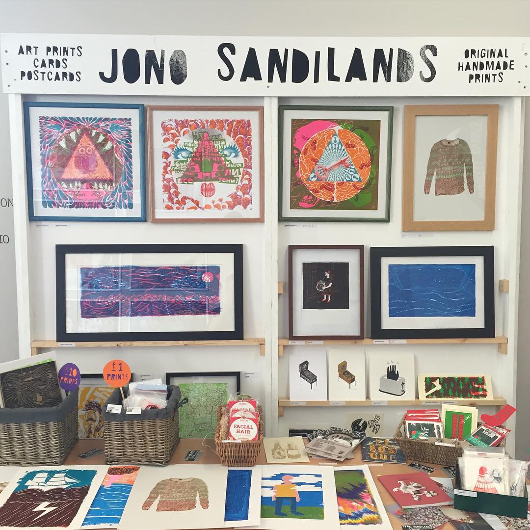
Revisiting these old prints reminded me one of the reasons I decided upon a printmaking course rather than a design course, its because I always turn to printmaking for 'creative relief' in my personal work, these are the things I do to fulfil my creative urges outside the commercial day job. Also I have lots of prints, please buy some! Email for a price list.

I always wanted the playfield artwork to be a reference to traditional pinball, but also incorporate my style particularly from earlier printmaking work prior to the MA.

Pick up where I left off
Picking up where I naturally left of using handmade methods to create effects and textures, I've found some ways to achieve these techniques digitally.

I really enjoy working out processes of how to do things, taking note of the steps to achieve a particular effect, then applying them multiple times under different circumstances. Although part of me strives to do these handmade, I have more flexibility with the end result working digitally. Also it's a lot faster.

Steps to achieve Noisy Gradients in Adobe Illustrator

One of the techniques I developed with help from the internet is to create what I'm calling Noisy Gradients


A section of the final art using the noisy gradient technique
Partly, the noisy gradients are a reaction to not wanting to use a halftone. There's limitations in control the moire effect on a bigger, lower mesh count screen. And also limited by the space I have to lay the play field wood flat on the print bed, so my plan is to use only solid spot colour style in the final screenprint. The noisy gradients were also inspired to some classic pinball artwork.

Roller Disco Pinball - image source

On a role / never sleep

Upon getting home last night I just kept working, before long it was 4am and I was pretty much done. I've taken the ideas and concepts from the lines of trajectory and the visual style of different techniques and brought them together in something which really is beyond what I really have thought it could have been. Sounds quite emotional and it probably is cause I've not had enough sleep!

Final playfield artwork, ready for print (high res) 
There's a level of simplicity I had hoped to retain in large areas of solid colour, but also as you dive in more there are interesting areas of textures and abstract chaos that my instinct wanted to include.

Method in the madness
After lasercutting I was blown away by some of the interesting grain in the wood, and how almost naturally wraps itself around some of the insert cuts. It was unintentional and totally unique to the bit of wood. It made me realise there were areas of wood I wanted to leave unprinted, the use of white space and less is more, having some breathing areas, and also reminders of what the object is built from.

Speaking in terms of how the artwork applies to the actual pinball game. The basic concept is; where the ball travels towards a main target area, the art is quite linear, direct and flat, but after a target is made there are little pockets of explosions and chaos that will ensue in the artwork and in the game, which I plan will get more intense as you progress and the longer you play.
Mockup how it might look printed, although impossible to fully get a good idea till it's printed!

Would it look different if I did it again? 
Yes of course! And after I print and assemble the parts I will notice mistakes and changes I would to make, but it's at that time in the process where I need to stop - I've invested time and energy into it and believe that will shine through in the final work.

Although I'm a bit behind my ideal schedule, it's full steam ahead printing!

Friday, 15 April 2016

Never: Cabinet Art Direction

From early on I had a pretty set idea for what I thought the cabinet artwork would look like: large Never! logo on the side, a bit of a showcase of the typography, linking back to graphic design. 

Blender Render of the proposed artwork
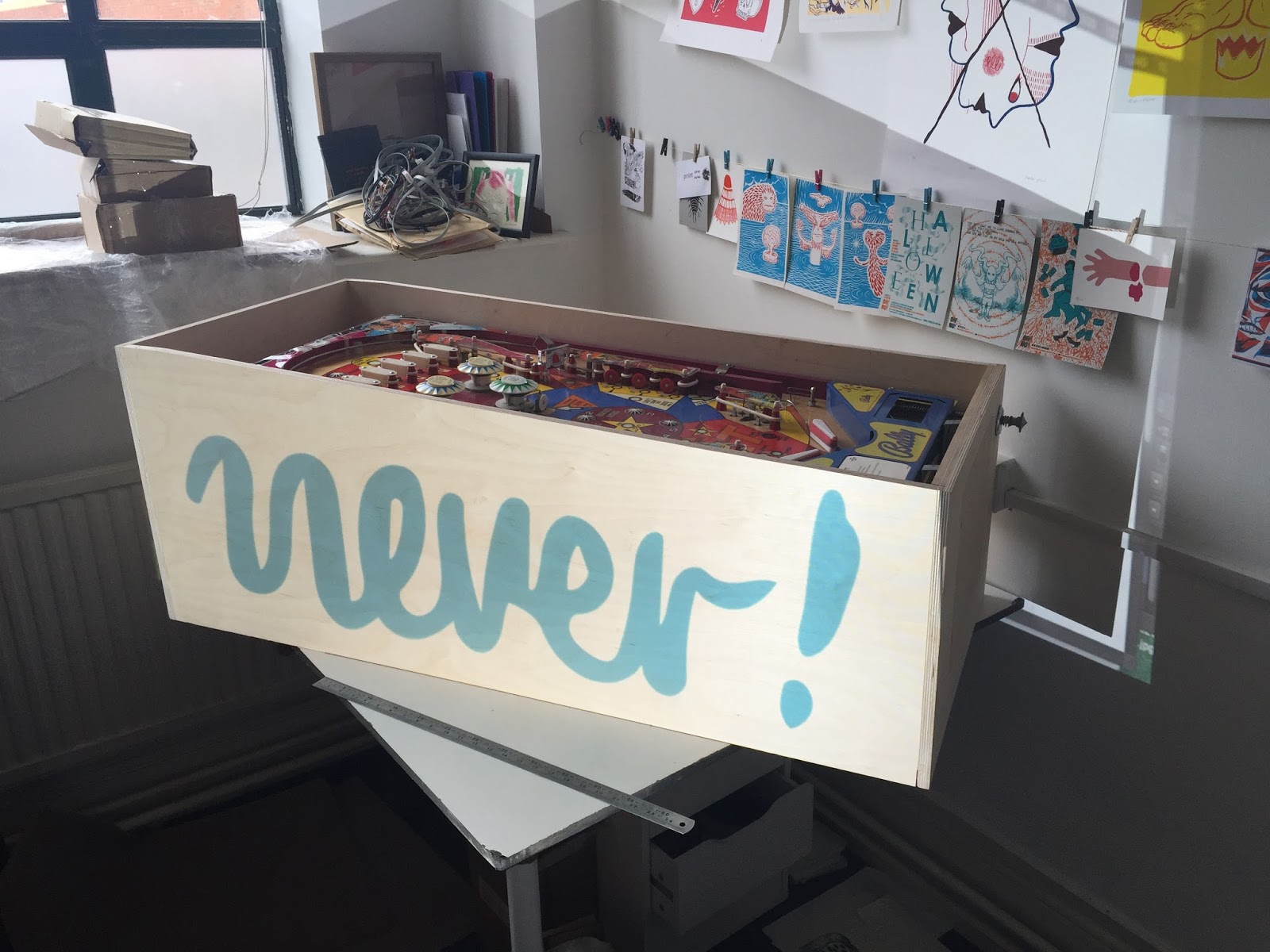
I made mockups and digitally projected onto the cabinet, to work out ideal sizing and composition.


Projections onto the cabinet to visualise artwork

I didn't make any alternative designs as I was content with how it was looking.

You know when you get an idea in your head and can't see past it? You need someone with fresh eyes to offer an alternative solution.

This is exactly what happened during two tutorials I had.

The first tutorial was with Oli Timmins. This is where I'd say what Oli does, but he doesn't categorise himself under any of the types of work such as a designer, printmaker, photographer, painter, illustrator, but classes himself as a 'creative all-rounder'.

Beetle #1 by Oli-T - from UpFest
I was immediately inspired by Oli's work and relate to this multi-disciplinary approach. Oli speaks about how using digital tools, such as laser cutting and CNC alongside more hands on methods can lead to unpredictable outcomes. Working with digital and virtual tools and files to make physical and handmade objects really interests me.

When I spoke with Oli I had the idea of screenprinting directly to the cabinet. 

I had been putting off screenprinting due to the logistics of actually doing it - getting a screen that big, printing at the studio where there are no facilities. And of course the challenge of getting a decent print on the side of an already constructed object. It had so much stacked against it to go wrong.

Skull by Oli-T - from UpFest
Oli immediately told me I should look into spray painting, which he refers to as 'Vertical Screenprinting'.  He offered some advice about a different ways to make a stencil, and reminded me of all the amazing facilities I have at my fingertips, including the Scrapstore (for off cuts of old vinyl).

I know it seems obvious, as this is traditionally how artwork was applied to pinball cabinets, I've just never considered using street art/graffiti techniques in my work. I've shied away from it as never been confident to actually try it out myself.

Oli inspired me to go right out and buy a few cans of spray paint to test out the different methods of stencils. I'll go through these in a bit.

The second tutorial was with Otto, a graphic artist and also runs a screenprinting workshop near Bath.

Spread from Photoshop for Screenprinting book - Otto
Really want to get my hands on a copy of his new Photoshop for Screenprinting book!

I went into the tutorial with Otto really in desperate need of some guidance and direction with both the cabinet and playfield artwork. 


I had made this big mess of a collage on a big piece of paper trying to quickly sketch some of my initial ideas down. The ideas were handmade styles I thought I wanted to include, handmade techniques as a reaction to always working digitally. Otto was confused! He couldn't work out why I was working handmade and focussing on loose abstract styles.

He said I should see the pinball machine like a book.

This could possibly be one of the most important things I could have been told at this point in the project.

It makes so much sense:

The cabinet is the cover of the book
It grabs attention and pulls you in

The playfield is the contents, the story
It takes people on a journey, there is a start, middle and end

He said The art could relate to this idea of a book in a bold graphical way, you have under utelised the potential of the pinball machine canvas. Play into it.

So although coming out of the tutorial knowing how much more work there was to do, I got exactly what I needed to move it on to another level.

More to come... I'll continue the cabinet art into a different post later.