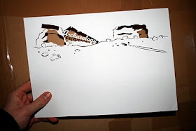
My latest completed project was to produce a set of illustrations to be featured in the themed itineraries of Promote Shetland's 2010 Pocket Guide.
The guide will be quite unusual, quirky and something that people would want to keep as a souvenir of Shetland. The publication will be predominantly pre-arrival material and will be Promote Shetland's main marketing tool aside the web. (www.shetland.org)
Promote Shetland asked me to come along and present to them some concepts for possible styles that could work in the guide. They had quite liked the work and the papercut style I achieved whilst working on the Gman: Contemporary Craft project, which had been seen around Shetland Museum & Archives where Promote Shetland are based.
Straight away I knew that a handcut paper style would suit what they were looking for. I thought I would experiment with a random 'Shetland scene' - trying to achieve a 3D depth of field with layers of paper - some textured/patterned - built up on top of each other.


You can see what I was trying to do with the scene, didn't really work fully as intended, but the piece still allowed me to show the concept, and I could physically show how the idea could work with development and studio photography.
I also presented a really rough mock of another idea using blocked out shapes and text, using another random 'Shetland scene' - for example purposes.


The team at Promote Shetland agreed for me to take this concept forward for each of the five themed itineraries: Bird Watching & Nature, Island Hopping, Walking, Archaeology and Shetland with Kids.
I worked on tightening up the style and kept a consistency throughout for the final papercut pieces.
Each papercut started life as a quick rough sketch of the idea, then drawn out and traced backwards onto GFSmith Colourplan White paper and delicately cut. I always find it interesting looking at the original sketches for other designers and illustrators so here are some sketches:


It was important to really concentrate as some parts of the original drawing were wrong and had to change as I cut, because of technical issues, keeping the image together. Sometimes if I went ahead and made a cut, I would loose an integral part of the papercut, so I always had to be one step ahead and be prepared to be flexible with the image. I feel this really helped the final pieces.


When I receive a copy of the guide I will post pictures of how Promote Shetland's designers took the papercuts and applied them to the style of the whole Pocket Guide. I found it quite intriguing to see how another designer worked with them. I will pick up on that when I post the finals.
Thanks for looking.

lovely work !
ReplyDeletedeirdre
Thanks Deirdre! Very pleased with the final cuts!
ReplyDeleteThese are beautiful - I love!
ReplyDeleteCheers Hannah.
ReplyDeleteHope your keeping busy!?